Inbox Placement Rates Explained: What They Actually Measure
Deliverability advice online often sounds deceptively simple.
“Track this. Ignore that. Fix this one thing and your inbox problems go away.”
It’s catchy. It’s easy to skim. And it sounds great on social media.
One of the most common examples is inbox placement rates — a metric that gets referenced constantly in deliverability conversations.
The problem isn’t that advice like this is completely false.
It’s that weak, partial, and derived signals often get presented as clean truth… without the context needed to understand what those metrics can (and can’t) tell you.
Unfortunately, the inbox doesn’t really care about any of that. ¯\_(ツ)_/¯
So today, let’s talk turkey about inbox placement rates (and their cousin, the spam placement rate): two metrics that get mentioned a lot, but rarely with enough context to understand what they mean.
Let’s start with what these metrics are and how they’re calculated.
What is an inbox placement rate?
An inbox placement rate (IPR) is a derived deliverability metric that estimates how often messages land in the inbox rather than spam. Because mailbox providers do not report inbox placement directly, these rates are typically estimated using seed testing and other proxy signals.
How to know your inbox and spam placement rates
Here’s the most commonly misunderstood truth about inbox placement metrics: senders can’t actually know where their messages land.
Because mailbox providers tell us whether a message was accepted or rejected, but once the receiving mail server accepts the message, they hang up the phone.
They don’t tell us whether each message:
went to the inbox
landed in spam
was placed in a tab or filtered into a folder, or…
was dropped into a black hole to never be seen again (hello, Microsoft)
That information exists… but it’s only visible to mailbox providers and your recipients.
Which leaves senders in limbo: how do you measure something nobody reports?
It’s like claiming that Bigfoot, Nessy, and the Mothman exist without even having blurry photos or a massive footprint as proof.
Where inbox placement rates come from
Some deliverability metrics are direct signals: things mailbox providers or real recipients actually report.
Others are derived signals: estimates created by interpreting other data to approximate something we cannot directly measure.
If your brain prefers analogies (like mine does), think about it like this:
Direct signals are like thermometers.
Derived signals are more like weather forecasts.
One measures something directly. The other estimates what’s happening using models and clues.

Inbox placement rates fall into the second category because mailbox providers don’t report inbox placement data. At least… not yet.
Which means they’re built from test environments like seed lists, not from real subscriber inboxes.
A seed list is simply a set of email addresses controlled by a testing provider. These addresses exist across different mailbox providers like Gmail, Outlook, Yahoo, and others.
When you run a test, your campaign is sent to these seed addresses along with your normal subscriber list. The testing system logs into those mailboxes and records where the message landed.
Inbox
Spam folder
Not received
Those results are then aggregated into metrics like:
Inbox Placement Rate (IPR)
Spam Placement Rate (SPR)
In other words, these metrics are estimates derived from controlled test accounts, not measurements taken from real subscriber inboxes.
In deliverability terms, that makes inbox placement rates what we call a derived signal — a metric that estimates something we can’t directly observe using proxy data rather than first-hand measurements.
Which can cause problems for folks who are overly reliant on them, because…
Inbox placement rates are guesses, not facts
Deliverability tools can estimate inbox placement, but they cannot observe it.
Prefer the short version? I talked about this exact issue in a recent interview with Jacqueline Freedman on The Making Sense of Martech podcast. In this chat, I explain why “inbox placement rate” is such a misleading metric and why treating it like a hard fact can send marketers down the wrong path.
On paper, inbox placement rates sound fantastic. You get clean, tidy percentages showing how much of your mail supposedly landed in the inbox versus spam across the top providers you send to.
In reality… those numbers are estimates.
💌 Seed accounts aren’t real subscribers.
They don’t open messages or click the same link four times in a row like we do. They’re far more likely to resemble your disengaged audience than the subscribers you care about — the ones opening, clicking, and converting.
Real people behave very differently.
They forward emails to friends, reply angrily to no-reply addresses, and smash the spam button after a bad day (... not that I would know anything about that).
And mailbox providers pay very close attention to those behaviors.
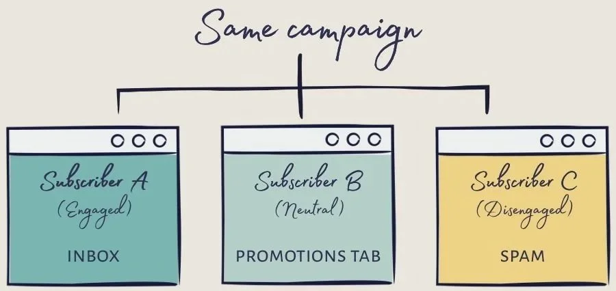
💌 Spam filtering is also highly personalized.
Two subscribers receiving the exact same campaign can see it land in completely different places depending on their history with that sender. Seed lists simply can’t capture that variation.
That doesn’t make seed testing useless. It can help you spot unusual trends or catch issues as they start to emerge.
But understanding their limits is important, because inbox placement rates are only one signal in a much bigger diagnostic picture.
💌 Inbox placement rates are not facts.
They’re directional signals generated from controlled test accounts that simply do not behave like your real audience.
And if you’ve worked in deliverability long enough, you’ve probably seen the downside: seed results suddenly look terrible, everyone drops everything to investigate… only to realize later that it was a false positive and production performance never moved.
Signals that deserve more weight
I don’t mean ones you should use instead, as in “replace completely”... more like alongside, and with greater weighting.
complaint patterns
provider-level engagement differences
reputation signals
bounce patterns
recent changes in volume, targeting, cadence, or content
These signals come from real production behavior — which is why they tend to be far more reliable than modeled estimates.
Direct signals you can trust
Seed test results aren’t always wrong. They can absolutely provide a directional signal that helps you spot an inbox placement issue as it’s emerging. But they’re still a weak signal and should never be interpreted in isolation.
That means bringing your production data into the conversation: delivery rates, provider-level opens and clicks, bounce messages, complaint patterns, and your outcome-focused metrics.
This is data that comes directly from mailbox providers or real recipient behavior.
This includes:
Bounce rates and responses
Spam complaints you can see in your ESP dashboard (via feedback loops)
Gmail Postmaster Tools (GPT) reputation data
Microsoft Smart Network Data Services (SNDS) reputation data
Replies
Conversions
Actual delivery acceptance/rejection
These signals represent events that actually happened, observed either by the mailbox provider or by the recipient interacting with your mail.
Why derived signals exist
Before we talk about which signals deserve more caution, it helps to understand why derived metrics even exist in the first place.
A derived signal is simply a metric that estimates something we can’t directly observe, usually by interpreting other available data.
And in email, there’s a big reason the industry relies on them…
Because mailbox providers intentionally limit what senders can see. They’ll tell us if a message was accepted or rejected, and sometimes provide reputation or complaint data.
But they do not tell us:
inbox vs spam placement
tab placement
user-level filtering decisions
algorithmic scoring details
They’re not doing this to make your life harder (promise). They do it to protect their users from spammers and fraudsters who would absolutely weaponize that information to try and game the system.
So the industry builds models and proxy measurements to approximate those outcomes. Those estimates are what we call derived signals.
Derived or inferred signals that deserve more caution
These metrics aren’t direct observations from mailbox providers or recipients. They’re estimates built by interpreting other data.
Examples:
Inbox Placement Rate (IPR)
Spam Placement Rate (SPR)
Deliverability rate (as many vendors report it)
Deliverability and sender reputation scores
Some engagement scores
Seed test inbox percentages
Because these metrics are modeled rather than observed, different vendors or tools can produce very different results for the same sender or campaign, depending on their methodology, weighting of signals, seed pool composition, and modeling decisions.
Which is a good reminder that no single metric tells the whole story.
You may have noticed one very common metric missing from both lists…
Opens.
Open rates aren’t accurate, but they can still be useful
People love to bag on open rates. Like… LOVE it. It feels like we can’t go a single day without someone declaring them completely useless.
Meanwhile, those same folks will happily tell you to obsess over inbox placement rates.
In reality, it’s not one or the other. We should be using them all.
Because just like with seed testing, opens are imperfect… nowhere near accurate enough on a one-to-one basis. And neither metric should be mistaken for direct evidence of inbox placement, because they’re not.
But from a deliverability perspective, beeps and boops and blips in provider-level open-rates can be a useful clue that something might be wrong.
Especially when paired with complaint trends, engagement shifts, and other reputation signals.
Here’s why: if mail goes to spam and isn’t dragged back into an inbox, then no open pixel loads, so no open is recorded. Apple Mail Privacy Protection (MPP) does not magically create an open for a message that just sits untouched in spam forever. Which is why depressed opens at a single mailbox provider can sometimes be a clue that placement is worse there.
Here’s what that might look like. If you’re sending to each of these domains with the same approach, then an open rate of just 4% at Microsoft should stick out like a sore thumb when compared to 20-25% at other top destinations you’re sending to (like Gmail, Yahoo, etc.)

I’ve written quite a lot about why your open rates are wrong in a past lesson.
The point here isn’t that opens are perfect… far from it! It’s that no single metric tells the whole story… not even when that metric sounds like an inbox placement-tracking dream.
TLDR
No single metric tells you what’s happening in the inbox.
Not inbox placement rates. Not opens. Not complaint counts.
The more signals you look at together, the clearer the picture becomes.
So the next time you see an “inbox placement rate,” take a beat and ask yourself:What signal is this actually measuring?
Did this one hurt your brain a little? Good.
That’s what happens when you stop looking for simple answers in deliverability.
If you cared enough to read this far, you’re probably the kind of person we built Sender Symposium in Barcelona for.
I’m partnering with the emailexpert team on parts of the programming and will also be leading a deliverability training and speaking at the event (happening next month).
The whole point is to cut through the deliverability mythology and have candid conversations with a room full of practitioners comparing notes on what’s actually happening in the inbox… the folks doing the work (just like you!).
If that sounds like your kind of room, get all the deets here:https://sendersymposium.com/lauren/
(Send It Right readers can use code LAUREN for an exclusive discounted rate. I have a limited number of larger discount codes — reach out if interested; while supplies last.)
Want more content like this in your life? Yeahhhh you do.
Send It Right is a blog and weekly(ish) newsletter for marketers and email practitioners who want to reach the inboxes (and hearts) of email recipients. Join 1,300+ other email nerds in subscribing to get the next edition directly in your inbox. 💌